Intro
Company
WonderBill
Project
Bill management app
When I first started at WonderBill, the app had limited functionality and felt dated. However, it was helping people manage their bills and ultimately helping a small number of those save money. My job was to design and test new features, improve the design and bring it up to date, and to improve the overall user experience ultimately improving a number of KPIs.
Problem
The app was clearly useful for users, we could see that in the data and reviews in the app store but we knew we could go further to help customers manage their bills.
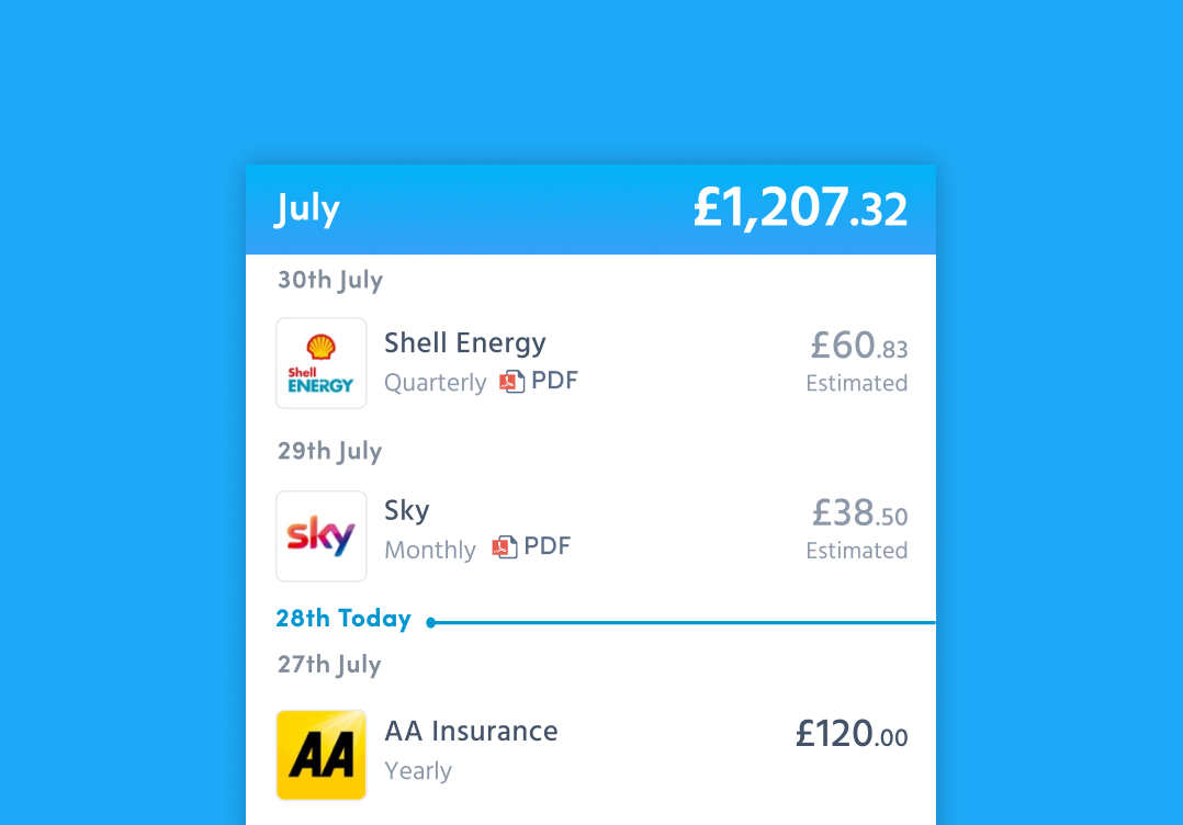
After earlier user research, we found that users were having issues with knowing how much they had left to pay as the app only showed the total amount due for a particular month rather than paid and is still due. There were a few issues with the accuracy of bill amounts and showing when the bill was due. This was down to some technical issues that didn’t have an easy fix but did have a negative impact on the user experience.
I set 3 objectives for this project:
- Help users better manage their money
- Increase the accuracy of the data
- Increase monthly active users and retention.
Research
I wanted to learn the first thing the user wanted to see was after they had opened the app. i.e. If they only had 5 seconds to open the app what did they want to see? From there I drilled down into more details.
I had to understand what limitations there were with the data and what I could show to the user. This required talking to the dev team and coming up with solutions that were achievable in the time frame we had. I needed to be sure what we showed was accurate enough not to cause a negative experience for the user. I needed to find out from users what they felt about data being inaccurate and what actions they would take. I had to convince the business that we needed to tackle this problem as it was inevitably going to add time onto the project.
Competitors
There were no real direct competitors of WonderBill. However, there were a number of open banking and bill management solutions. I needed WonderBill to stand out and not make the same mistakes the other solutions were making.
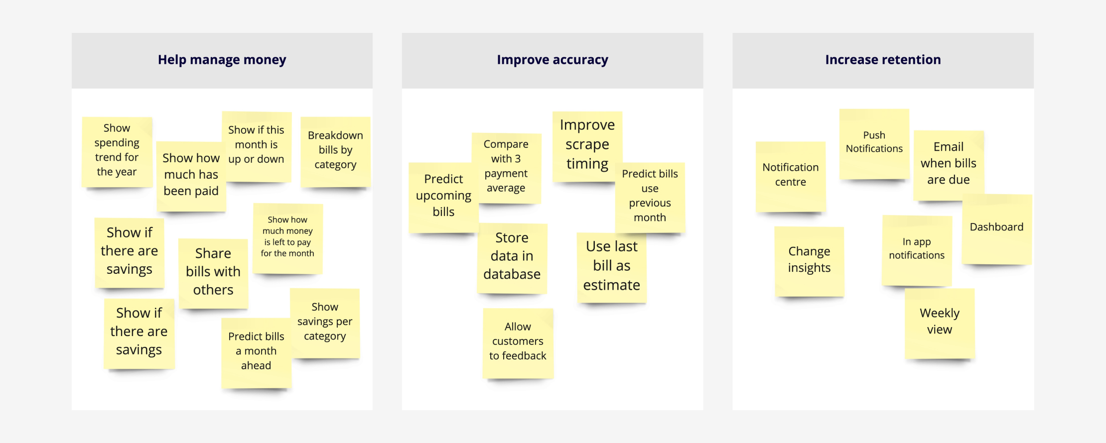
Ideation
There were lots of ideas generated from the brainstorming session. We managed to shortlist them to a handful that would help us achieve the goals I set out at the start.
Design
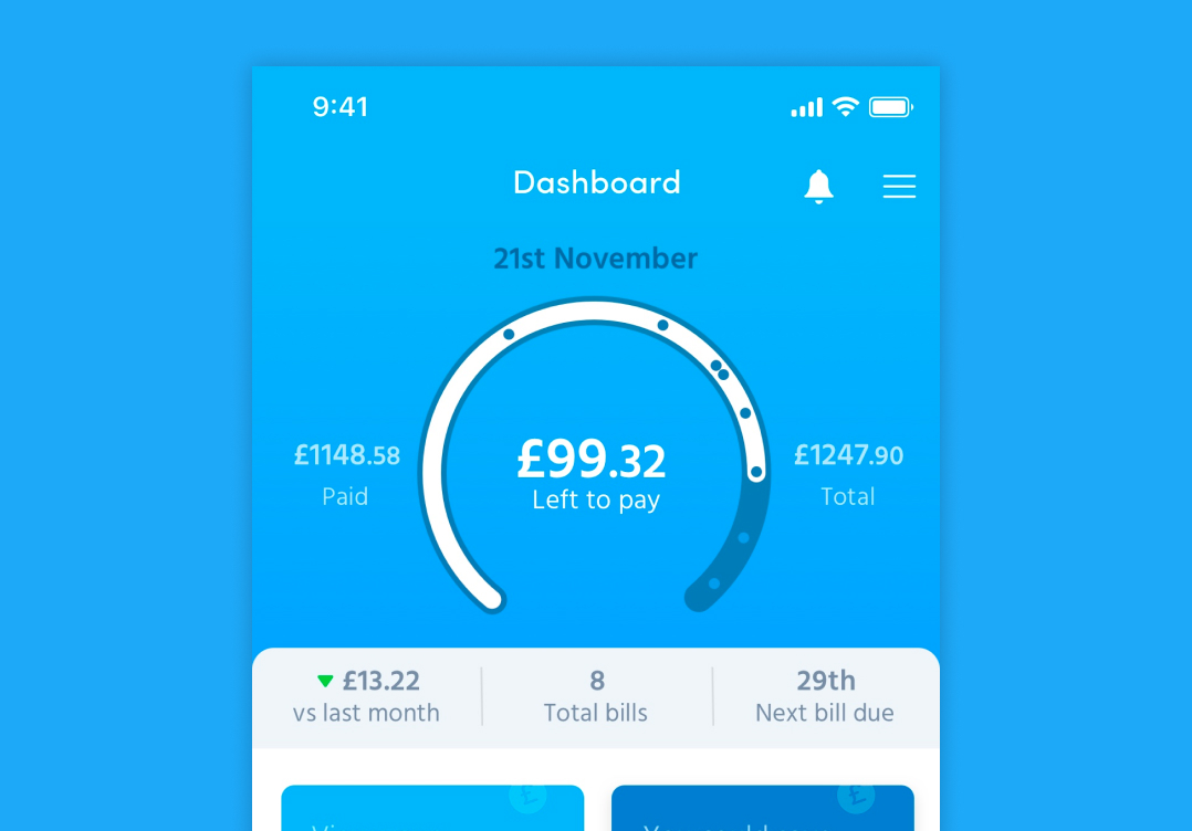
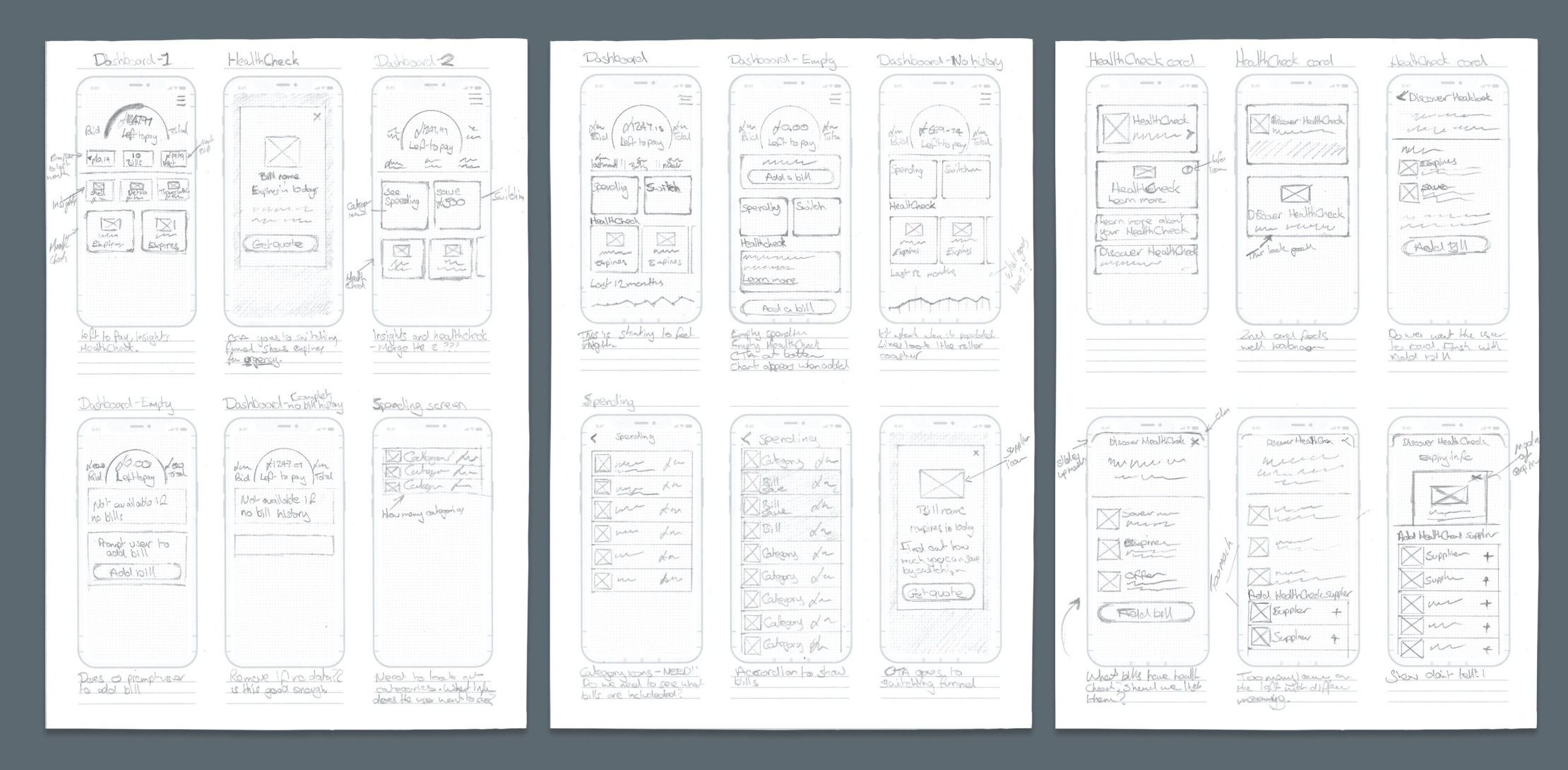
Dashboard
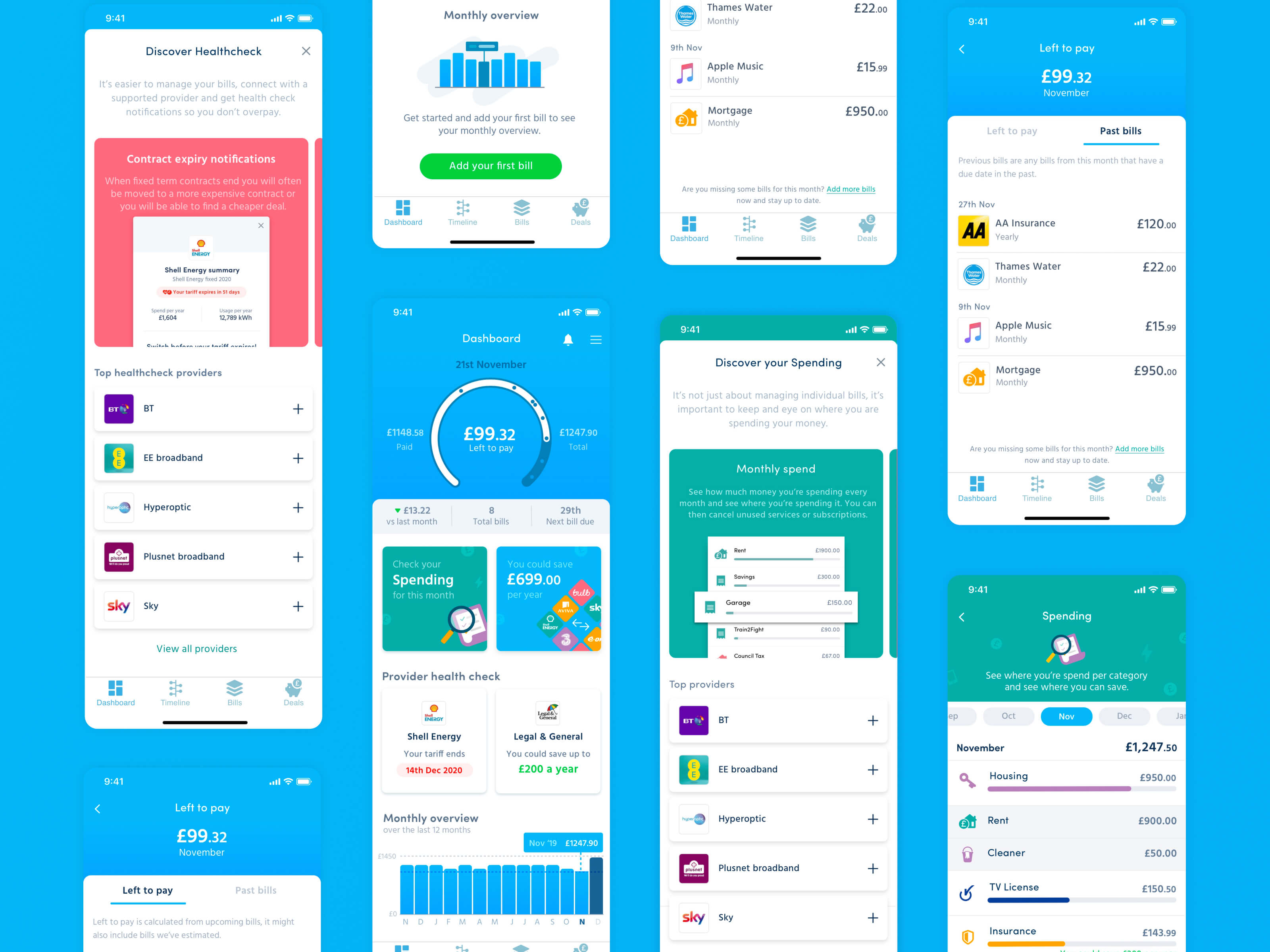
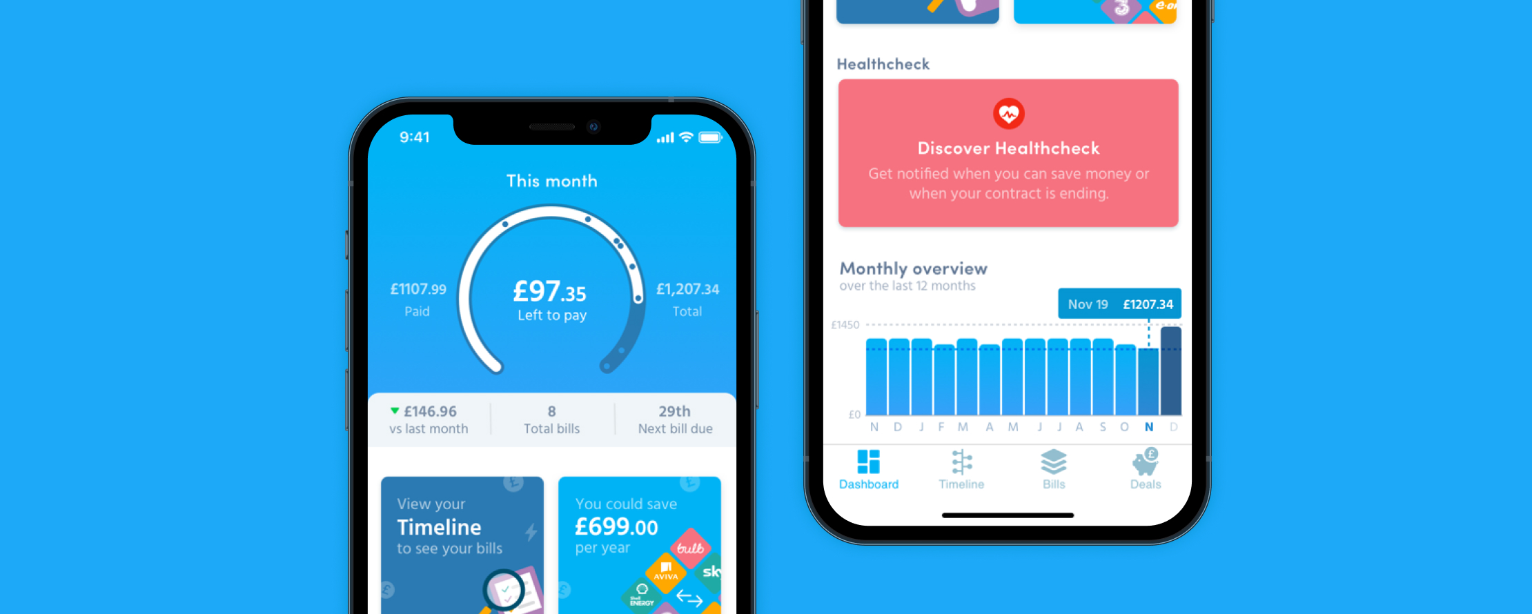
The dashboard becomes centre of the app. We explored options that included not having a dashboard. However, there was just too much information we needed to display, so it deserved its own space. The results and initial feedback from the dashboard were great. It was very clear where the user stood with the state of their bills at just a glance, and on the plus side we stood out from our competitors.
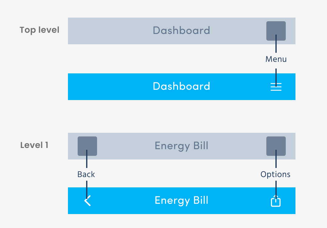
Navigation
I needed to restructure the navigation of the app to accommodate the new screen. I gathered all the screens and documented the different navigation types that were in the app. I then simplified and made the navigation consistent across all levels. Making it easy to understand when a user navigated away from the top level.
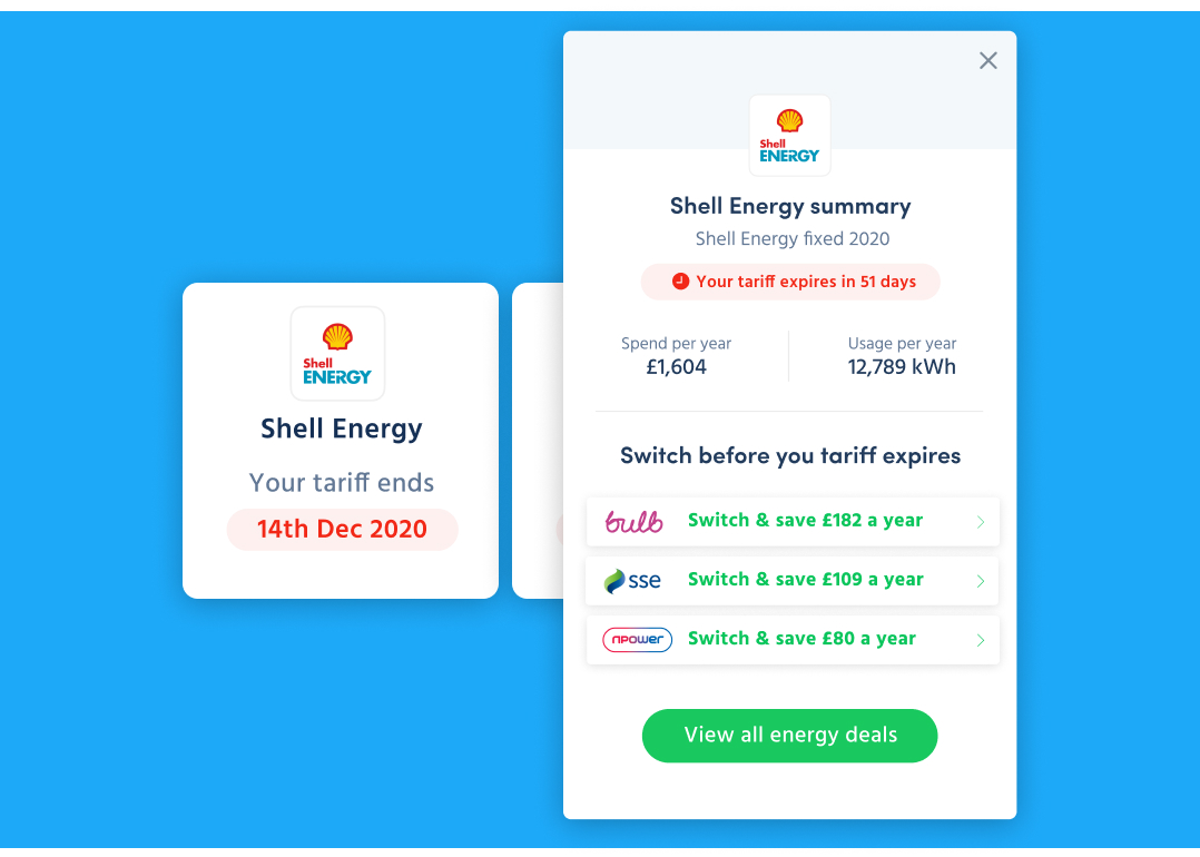
HealthCheck
I planned to create spending and bill insights for our users but we didn’t have enough data available so we had to make some compromises. We ended up creating the HealthCheck which would let customers know when their tariffs and contracts were coming to an end. We’d then show how much they could save and give them access to switching.
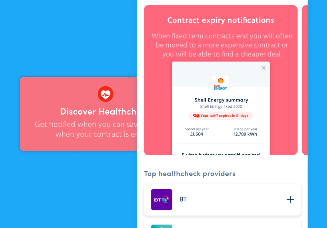
Discover
Too many empty states make an app feel boring and can be hard for them to get started. This is why I came up with Discover. The idea was to make interesting ‘empty’ states for when a user didn’t have any data in the app. I wanted to show the users what they were missing rather than just listing bullet points or a wall of text. The call to actions underneath related to the discover piece, for instance the HealthCheck add supplier list was a list of suppliers which were supported by the HealthCheck, encouraging users to add bills.
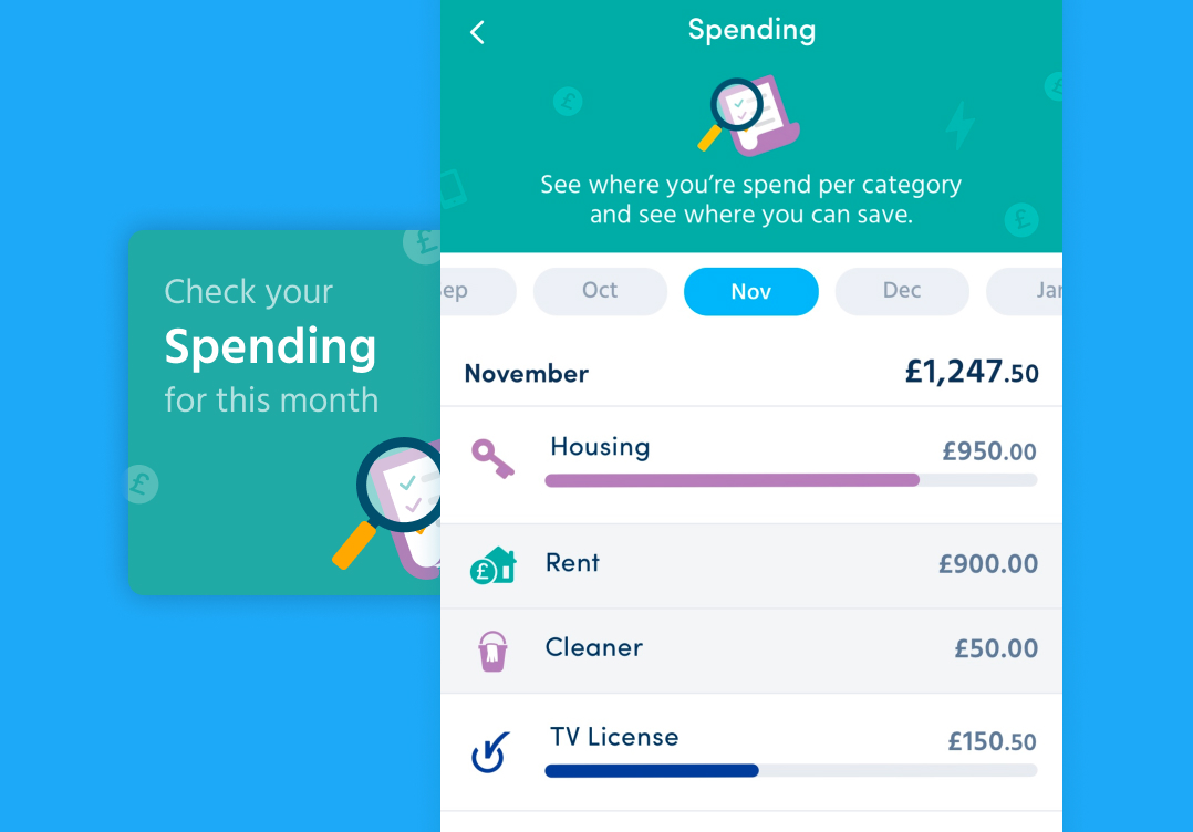
Spending
Spending was a really nice way we could show customers how they were spending their money and where WonderBill could save them money. Unfortunately, this feature of the dashboard did not make it into the app. This was down some data issues and the changes required were just too big for it to go into the release.
Predicting
To calculate total bills for the month we had to predict the amount of some of the bills based on the previous month or previous payment. We did some testing around this and customers didn’t initially like the idea. We had tested the version on the left and customers were happy with it and understood what it was.