Intro
Company
WonderBill
Project
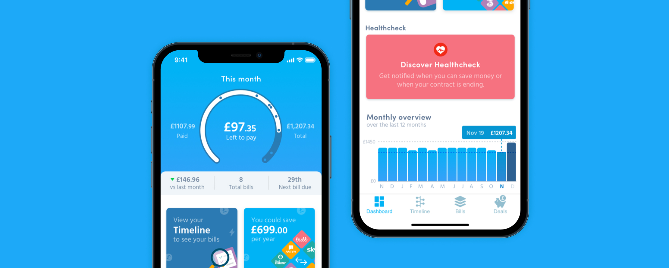
Bill management app
When I first started at WonderBill, the app had limited functionality and felt dated. However, it was helping people manage their bills and ultimately helping a small number of those save money. My job was to design and test new features, improve the design and bring it up to date, and to improve the overall user experience ultimately improving a number of KPIs.
Research
I had to learn how people managed their bills, how they tracked their bills over a period of time, and how they could save money every month. I started by conducting 10 in-person interviews, asking questions of what they expected. Following that I documented the participants using the app for the first time, highlighting the moments of delight as well as the moments of fright.
Establishing a good relationship with the Customer Service team at WonderBill was vital. They were great at dealing with customer queries, and had already done a lot of work to gather great feedback. They also had a lot of feedback from exit surveys and app store reviews that highlighted what customers liked and what frustrations they were having. Another team I leant on for information was the Data team.
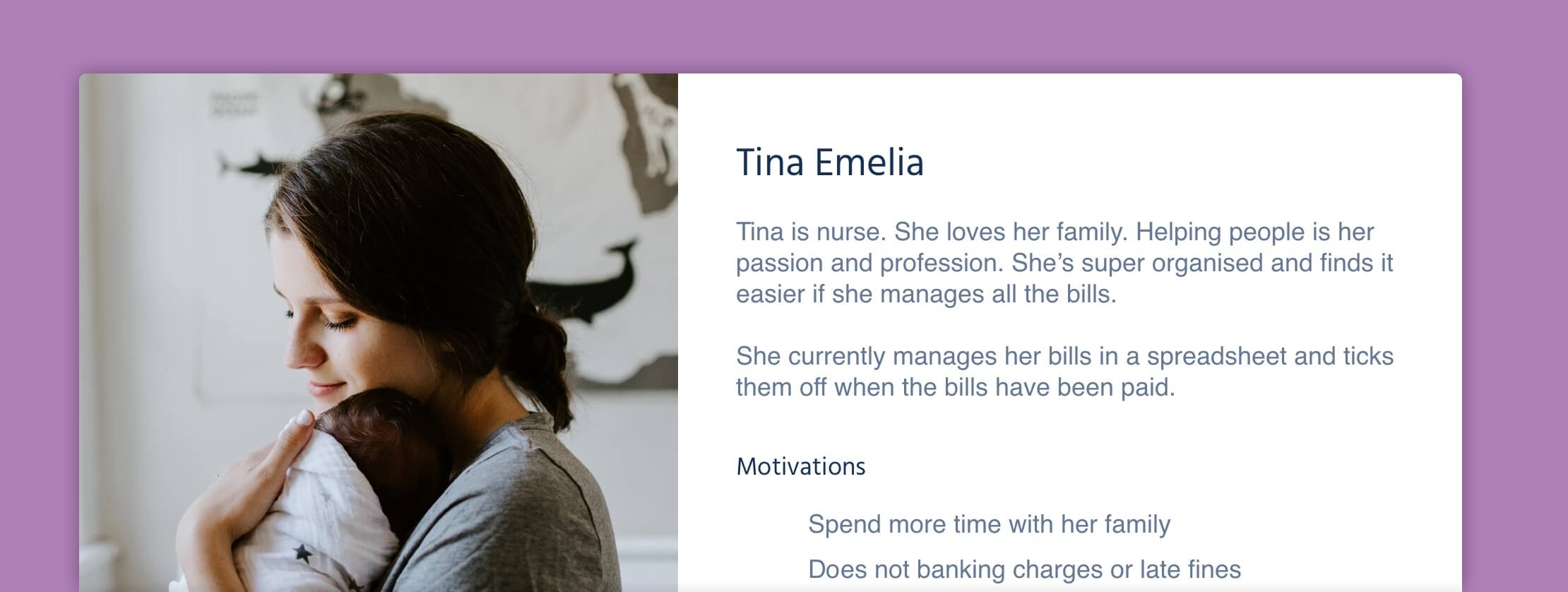
Who were we designing for
WonderBill had already created a number of personas. I felt that it was important to focus on the persona that had the biggest reliance on, and need for bill management. My belief was, if we focused on improving the experience for this persona it would give us a solid foundation to start building new features that would benefit the other personas.
Define
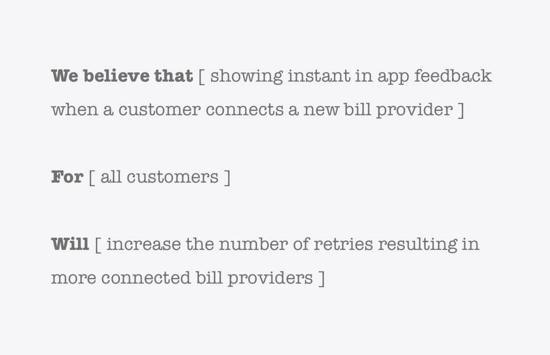
Design hypothesis
As part of the Product Team and one of the people helping drive the product roadmap I would create hypothesises to help the team determine what we were going to build.
When possible, we would test the hypothesis with the data team or test it with users by creating high fidelity prototypes. There were times when we could not prove the hypothesis with data or testing before development and we would prove or disprove the hypothesis with real life data.
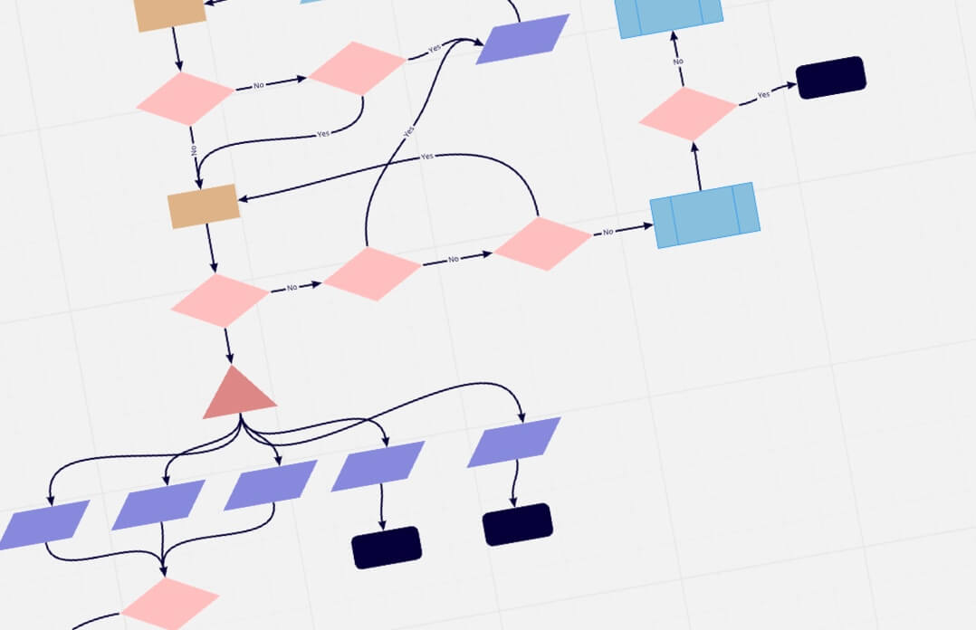
Understanding the backend
This is something I don’t see a lot of designers doing but I feel it’s important for me to help architect a solution. It allows me to chat about possible solutions with the development team often ending in reduced development time while still achieving the desired result for the end user.
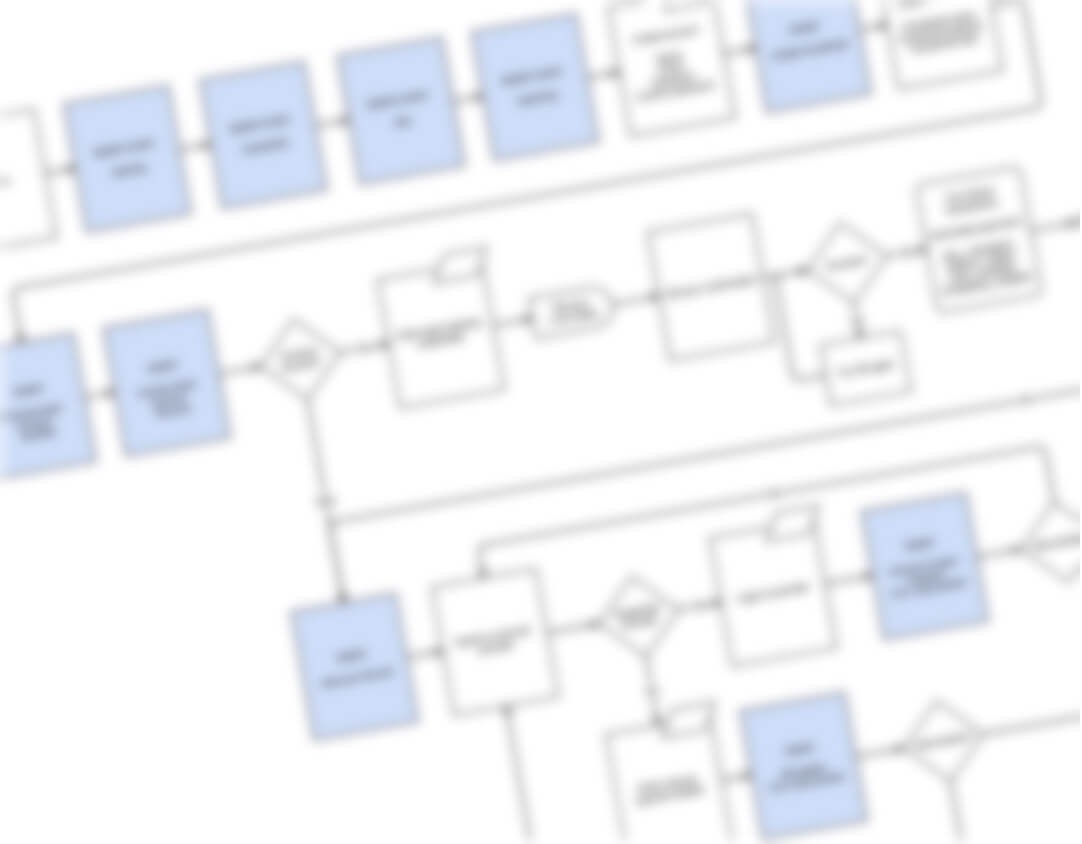
Some of the back end flows were not documented so I had to create them with help from the development team. This sometimes uncovered things that were not known in the business that wouldn’t have been found if I didn’t follow this process.
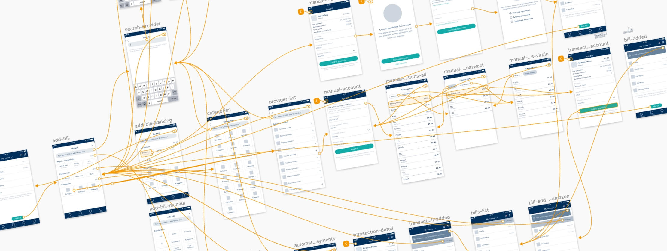
User flow
Depending on the complexity of the solution I would create a userflow to visually articulate the desired flow to the rest of the company. Most of the flows were in app flows, however I did create user flows for third party integration which involved working with third parties.
Ideation
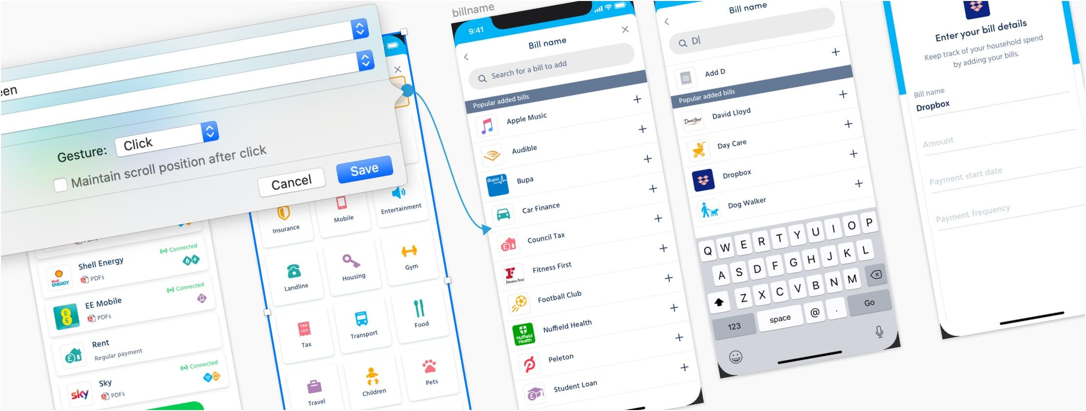
It’s time to start wire-framing. Often I would have sketched a few ideas by now. As I was managing the design team it was up to me to divide the work out among the designers. I would normally wireframe the bigger projects or projects which were proof of concepts to allow the designers to constantly get their work released.
Wireframe library
When I started at WonderBill the designers were creating high fidelity wireframes. This being a time consuming process I created a WonderBill mid fidelity wireframe library for Sketch. This made wire-framing consistent across the design team and made it easier when creating wireframes.
Prototype
Using Craft by InVision to prototype low, mid and high fidelity wireframes in Sketch couldn’t be easier. When I’m prototyping I test using Sketch Mirror or the InVision app so I can understand how the app feels and works in my hand.
Testing
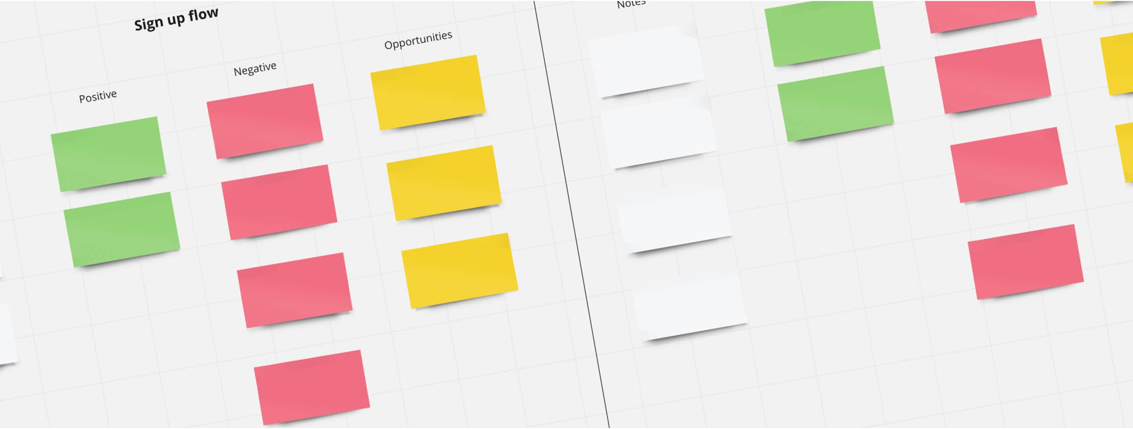
Being responsible for user testing at WonderBill I organised a number of live interviews for testing both the app and prototypes. I brought in UserTesting.com as our testing partner to allow us to easily add testing to our internal design process.
Most of our tests were with new users, so when I was creating tests I would get them to go through the process of researching the app and downloading it from the app store. I created an emotion scale which I used to track how they felt at the end of each task, I also used a number of quantitative questions that used a sliding scale to track how difficult they found task and how likely they would be to use this feature. With the quantitative data and the qualitative notes it was easy to see pain points and points of delight.
Revisiting the goals
Using the above methods we managed to make constant improvements to the user interface, user experience but most importantly to the KPIs. We were also getting postive feedback from user testing and from customers.
Design a modern feeling app
We couldn’t redesign the app from scratch, we had to evolve the current one into something modern. Even though improving the visuals was a goal, we couldn’t take too much time away from the development team. The first thing I needed to do, was create a design library of all the UI elements. This would allow me to see the inconsistencies and combine a number of elements with slightly different styles into something that could be easily reused by both the design and development team.
There were a lot of things that needed to be changed in the code to allow us to bring consistency to the app. This wasn’t going to be a quick job and would require a lot of patience from the design, development, and management team. I wanted to focus on navigation, transitions between screens, terminology and consistent UI elements. As I said we couldn’t take up to much time from the development team so every screen they touched, they tried to use the new UI elements that had been updated in the design library.
Improving KPIs
There were a number of new features we were focused on designing and developing to change the paradigm of the app that would help improve a number of KPIs. But it’s never just about new features. As the app needed a visual update it was safe to say the user experience needed a bit of love too. I documented the key user flows in the app to see where improvements could be made. I tested at least 8 participants for each flow on both Android and iOS measuring emotion and difficulty of each task. This along with the analytical data from data team soon pin pointed where we needed to make improvements that would have a positive impact on the KPIs.